
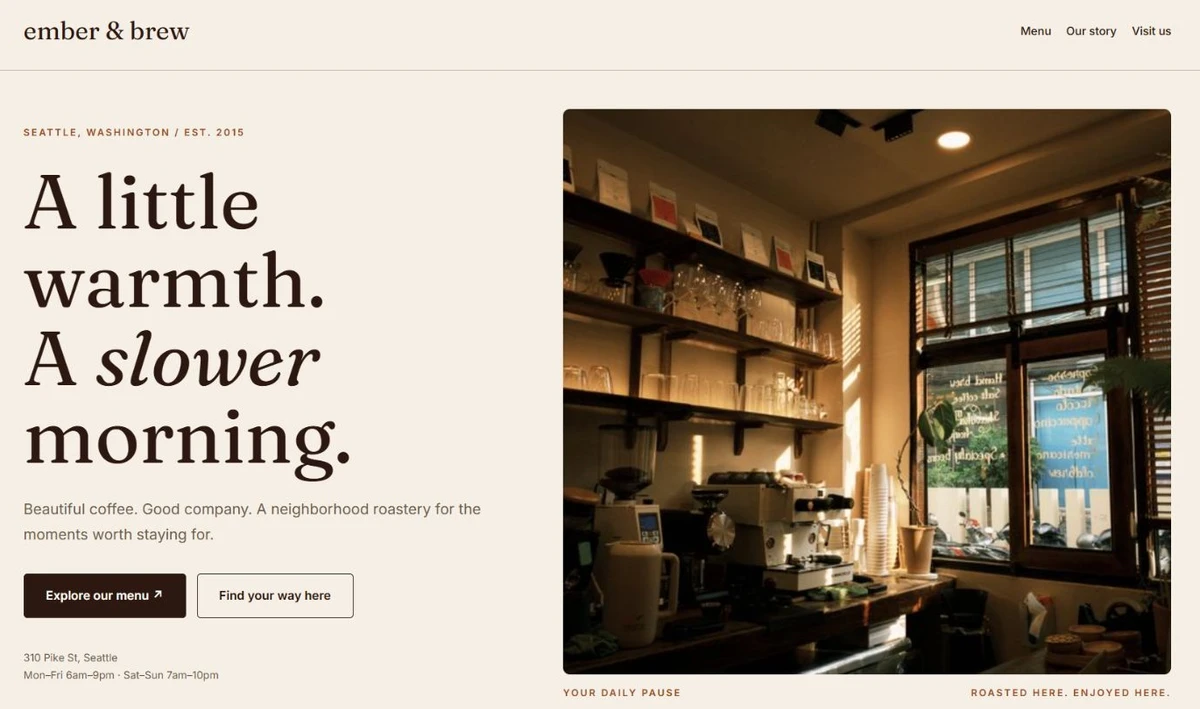
 A brief becomes a real page.
Custom Elementor widgets, ready to drop in
Widgets that appear in the Elementor panel like any other, compiled into a sandbox so a bad one can never break the editor.
100 results · page 2 of 5

Lottie Player
A Lottie animation from a URL or the Media Library, playing on load, in view, on hover, on click or with scroll.


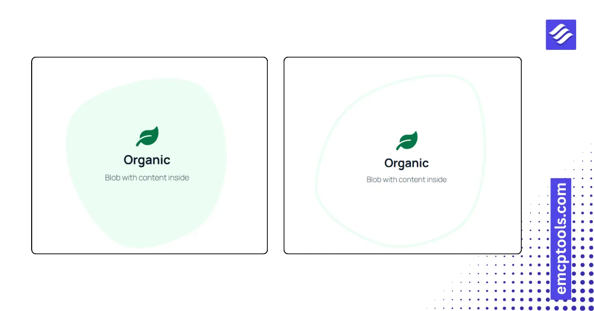
Animated Blob
A morphing organic shape filled with a colour, an outline or an image mask, with content in the middle.

Image Separator
A small image or icon that straddles the edge between two sections, with optional float, spin, pulse or swing motion.
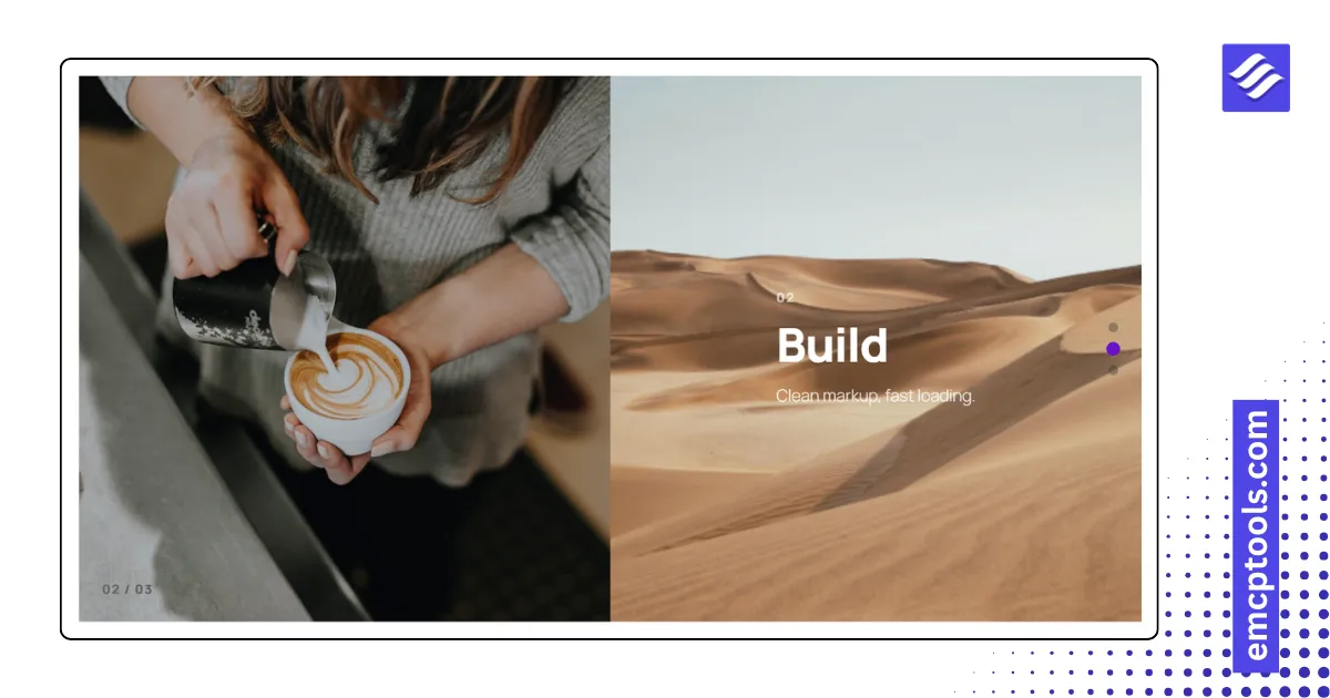
Multi Scroll
Split screen panels where the two halves move in opposite directions, snapping panel by panel or scrolling freely.
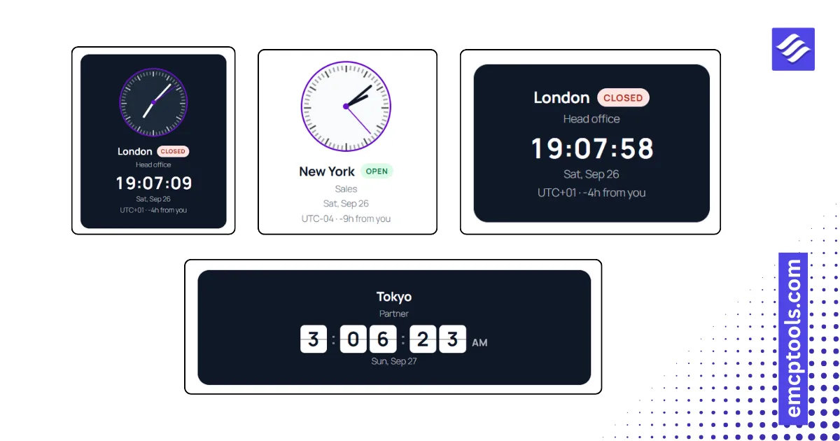
World Clock
Live clocks for several cities in five styles, including analog faces, a flip board and open or closed office badges.
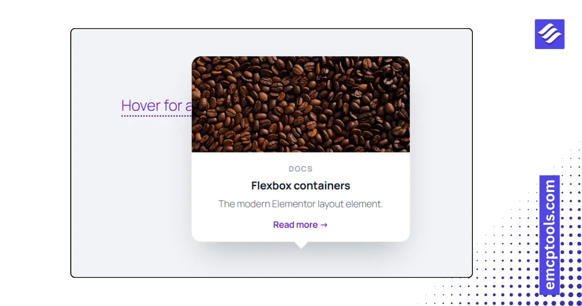
Preview Window
Hover cards for links or terms in your text, each showing an image, title, text, meta line and a button.
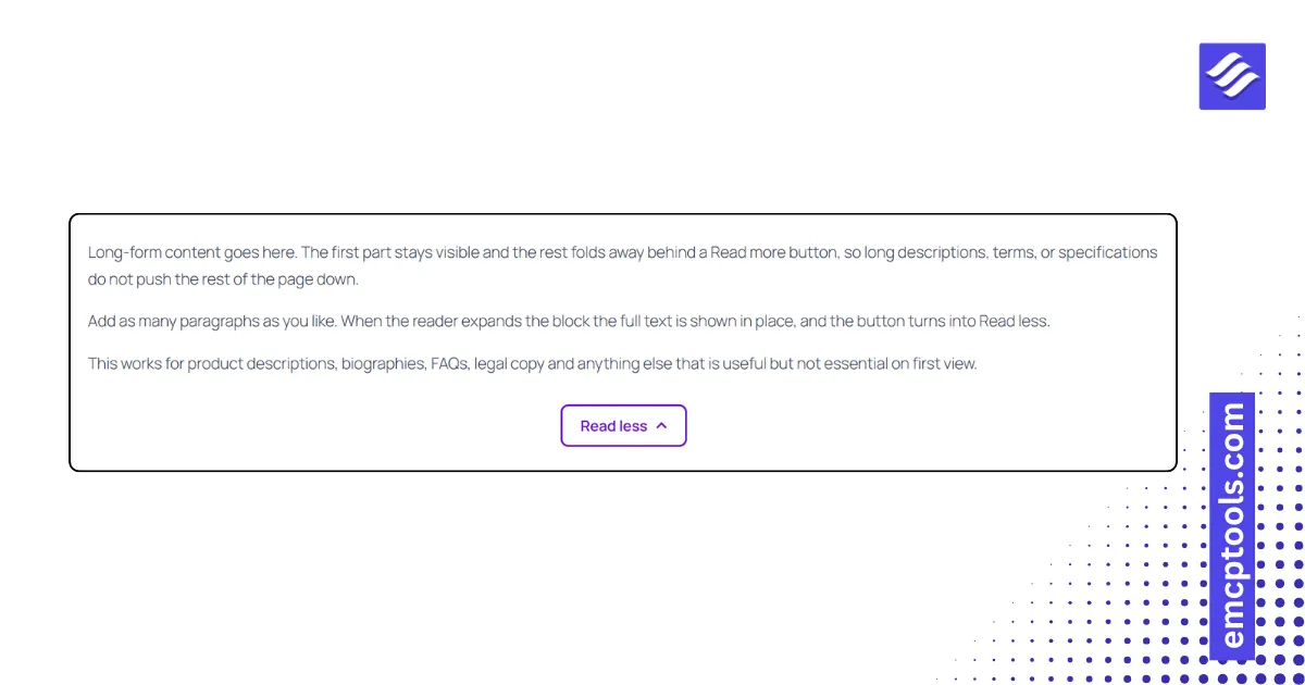
Unfold
Long copy folded to a height, a line count or a word count, with a Read more button and an optional fade at the fold.
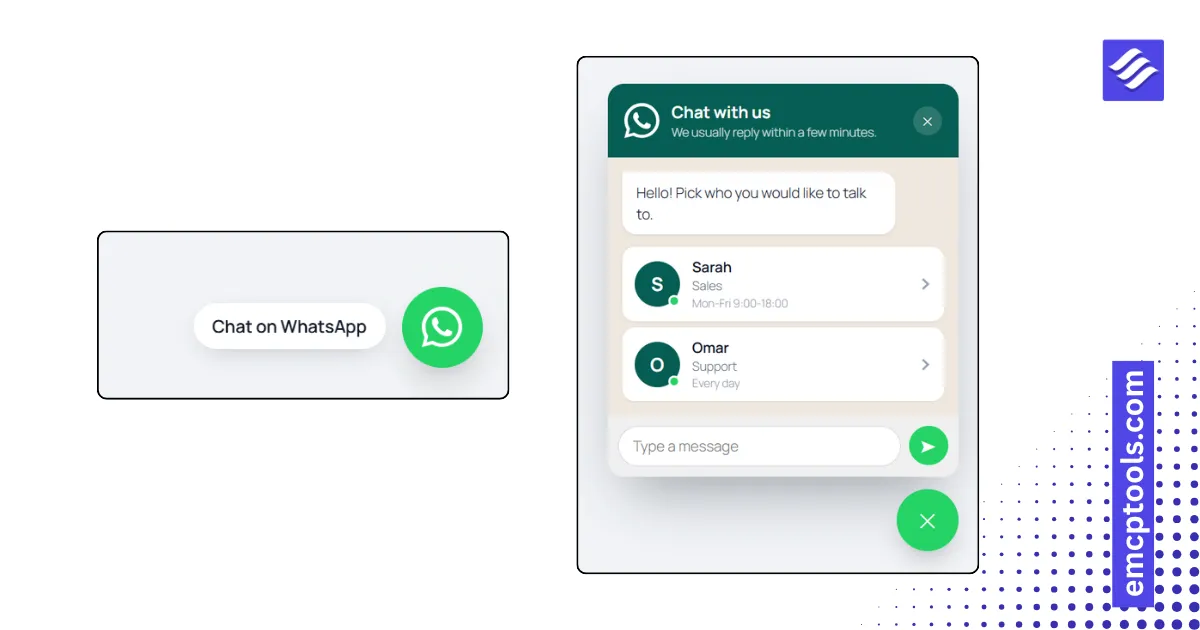
WhatsApp Chat
A WhatsApp button with a chat box, multiple agents, working hours and a pre-filled message.
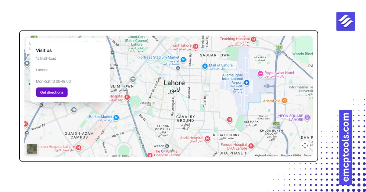
Google Maps
A map with an address card and a directions button, working with no API key, or with markers and styles when you add one.
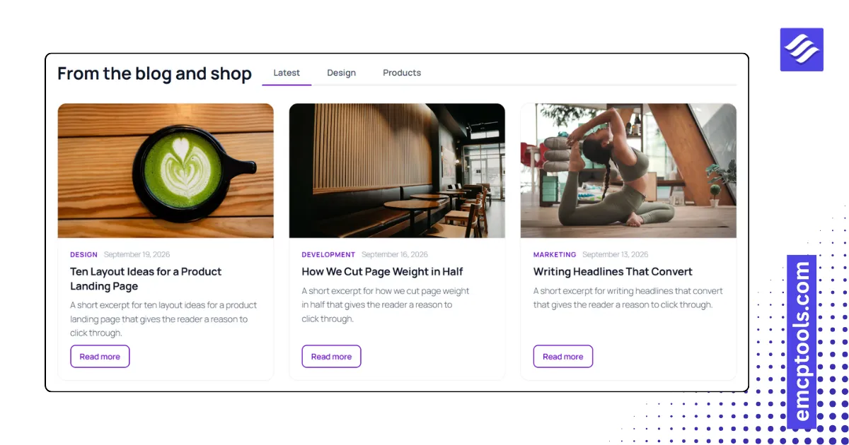
Loop Tabs
Up to five tabs, each with its own query, so one widget shows latest posts, a category and featured products side by side.
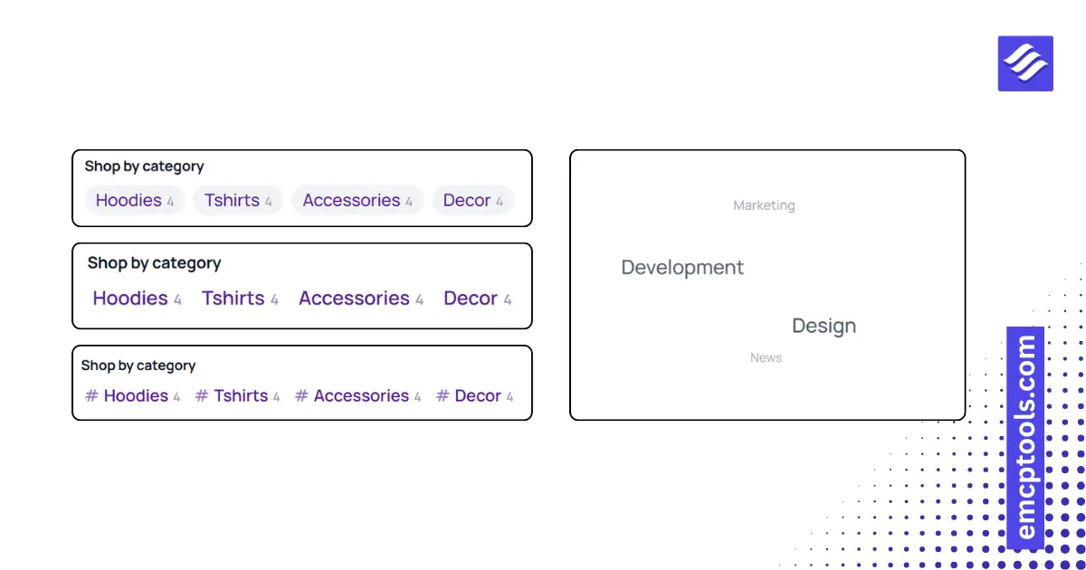
Tags Cloud
Terms from any taxonomy in six layouts, including a 3D rotating sphere, sized by how many posts use them.
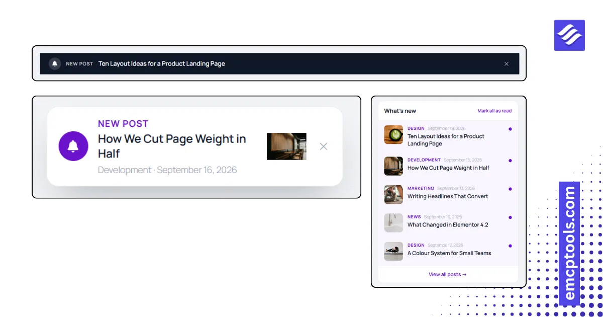
Recent Posts Notification
New posts as notifications: a bell with an unread badge, a cycling toast, a top bar or an inline list.
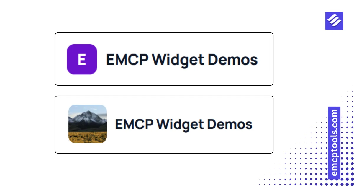
Site Logo
The logo and name from Site Identity in five layouts, with an alternate logo for sticky or dark headers.
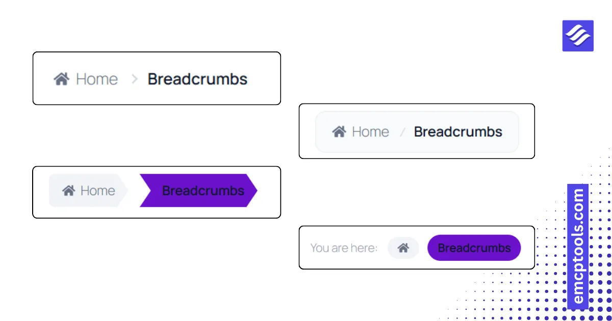
Breadcrumbs
A breadcrumb trail in five styles with six separators, middle collapsing on mobile and BreadcrumbList schema.
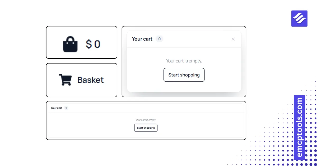
Mini Cart
A WooCommerce cart icon with a live count and total, opening a dropdown, a side panel or linking to the cart page.
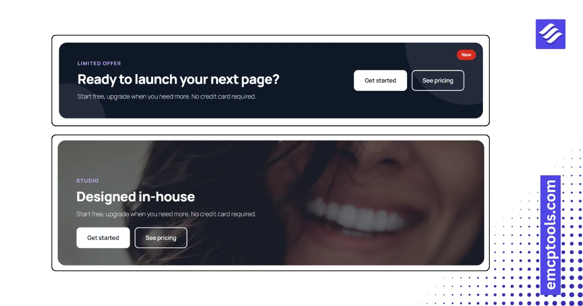
Call to Action
A full call to action block in six layouts: banner, centered, split with image, card with icon, cover image and slim bar.
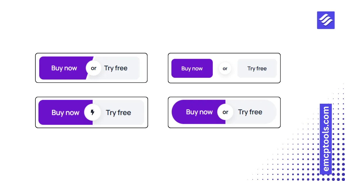
Dual Button
Two buttons as one unit, with an "or" connector: side by side, stacked, attached, split pill or diagonal cut.
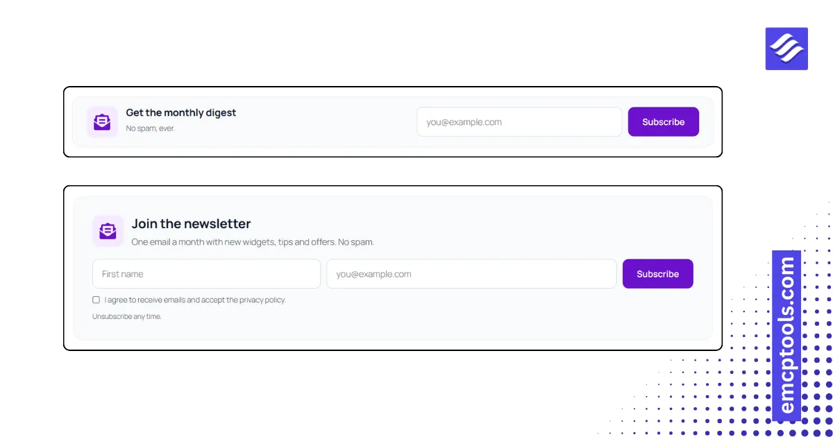
Newsletter Form
A subscribe form that posts to any provider embed URL, in six layouts, with consent checkbox and spam trap.
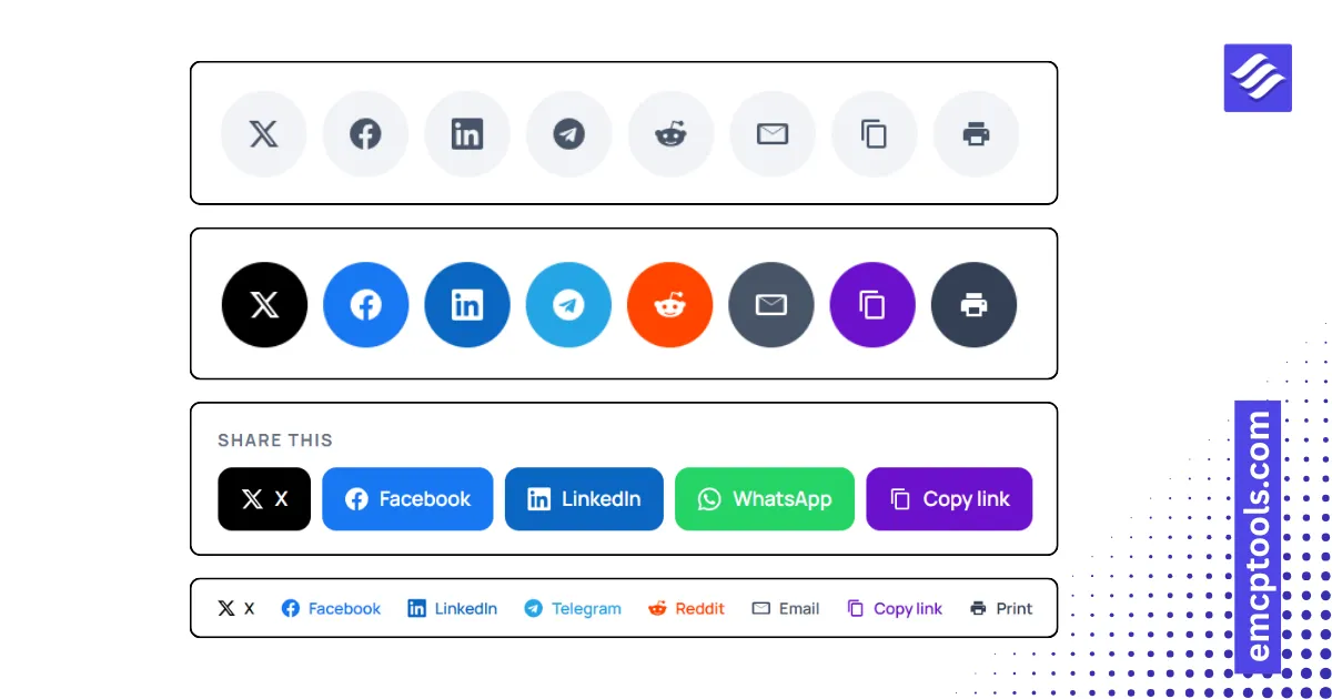
Social Share
Share buttons in six layouts including a sticky side bar and a mobile bottom bar, with copy link and print.
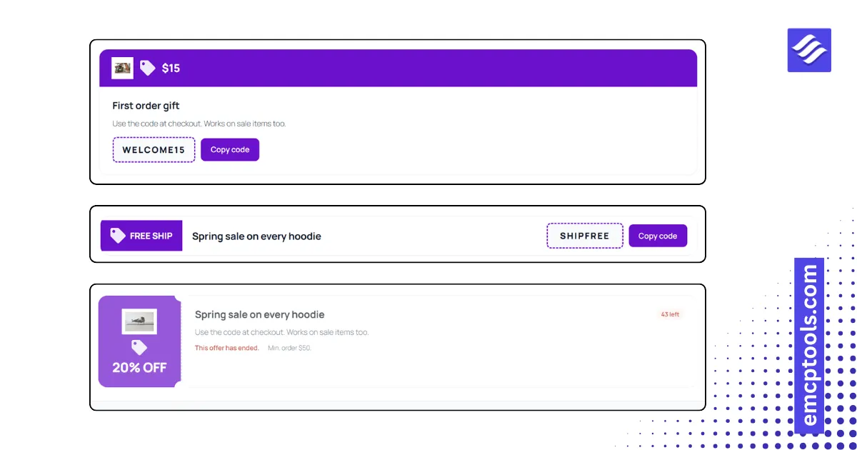
Coupon Card
A promo code card in five layouts with click to copy, a reveal step, a live expiry countdown and terms.
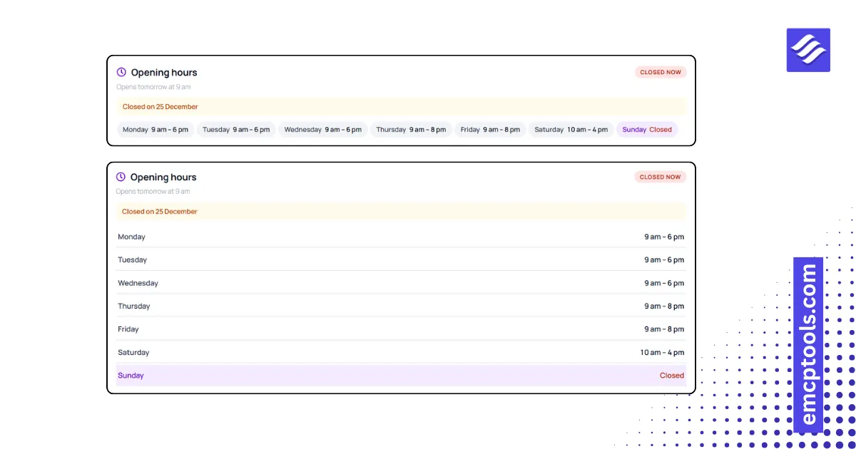
Business Hours
Opening hours in five layouts with a live Open now badge, the next opening or closing time and a set time zone.
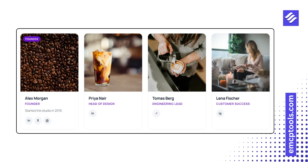
Team Grid
A team grid in six layouts with photos, roles, bios, social links and a flip card that shows the bio on the back.
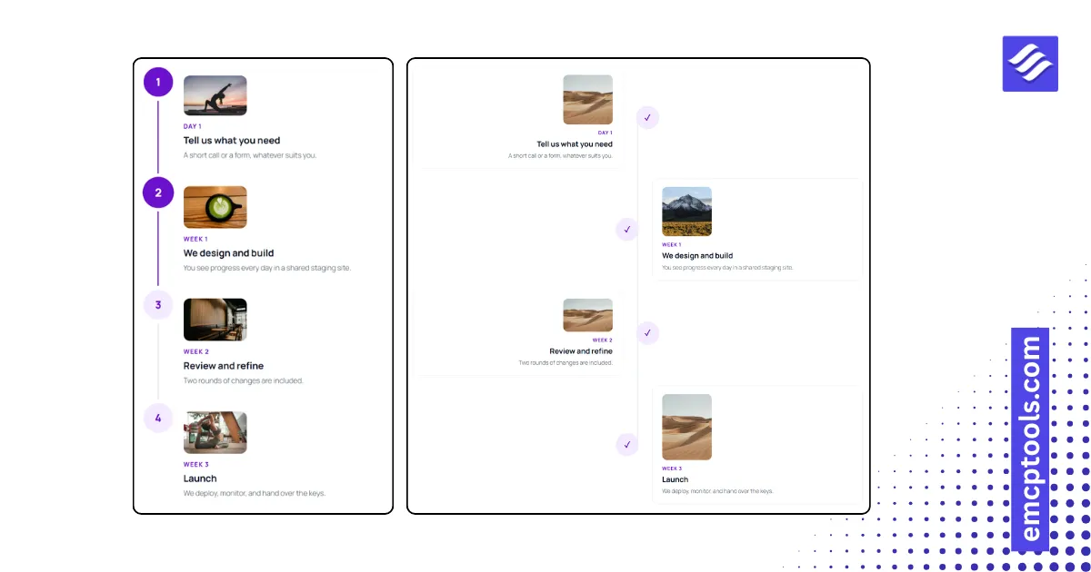
Process Steps
A numbered process in six layouts, including chevron arrows and a connector line that fills as the page scrolls.
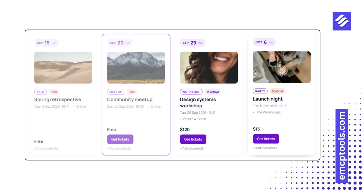
Event List
An event list in five layouts with date badges, countdown labels, sold out flags and Add to calendar links.