
Custom Elementor widgets, ready to drop in
Widgets that appear in the Elementor panel like any other, compiled into a sandbox so a bad one can never break the editor.
45 results · page 1 of 2
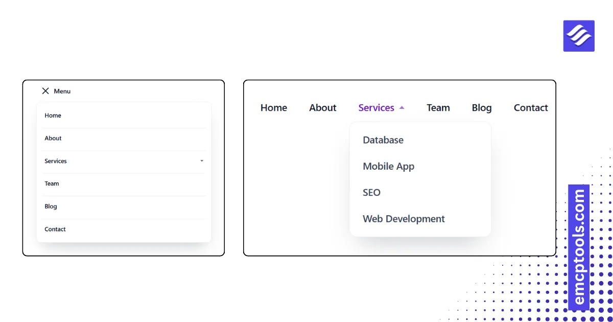
Advanced Menu
A WordPress navigation menu with dropdowns, five desktop styles and three mobile modes (dropdown, off-canvas, full screen).
 MSR Builds
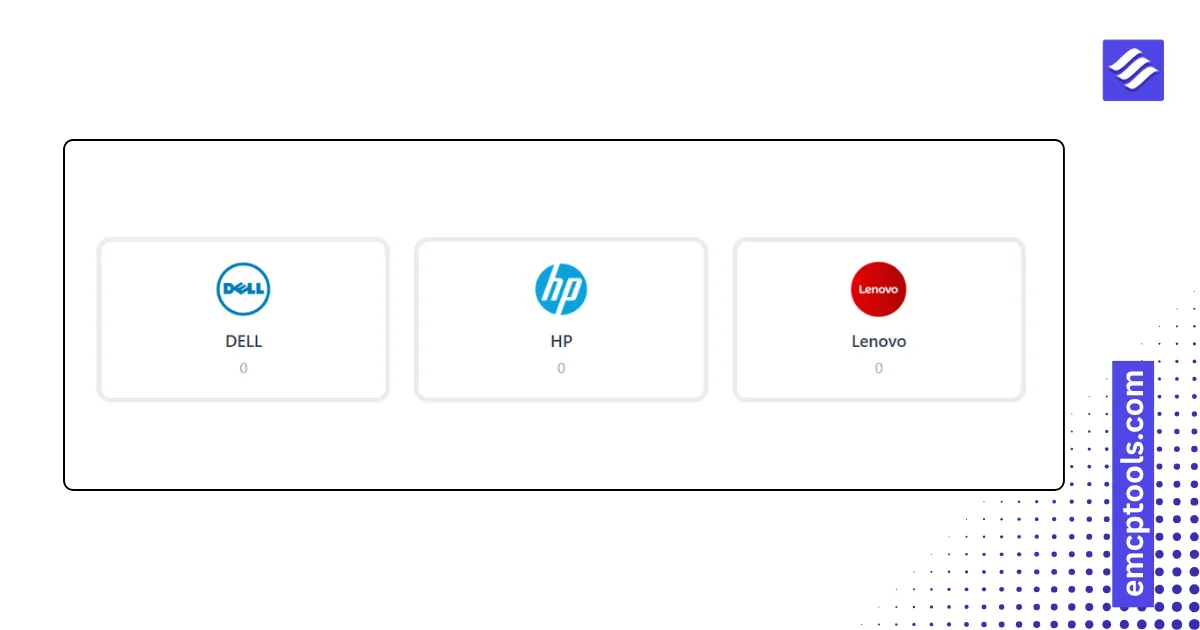
Brands
WooCommerce brands as a logo grid, logo cards, a scrolling strip, an A to Z list with counts, or pills.
MSR Builds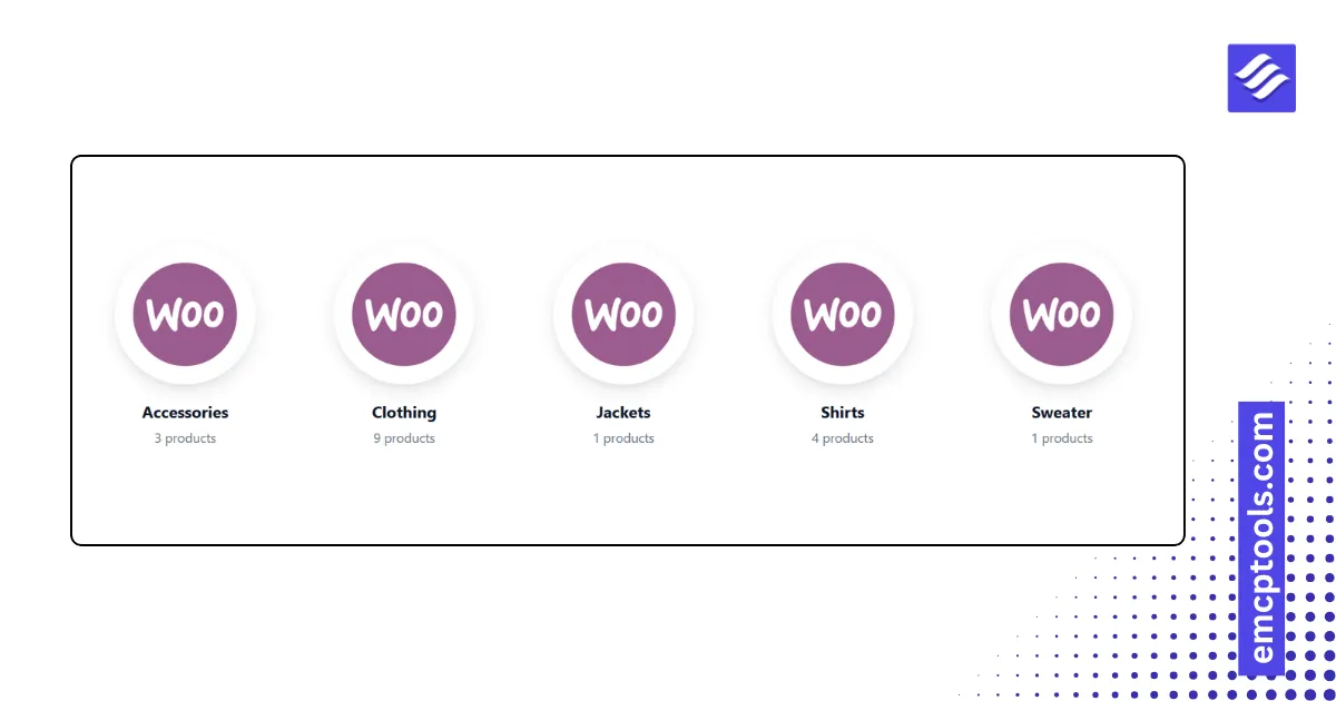
Product Categories
Category tiles with thumbnails and product counts in six layouts, including an overlay mosaic and a pills row.
MSR Builds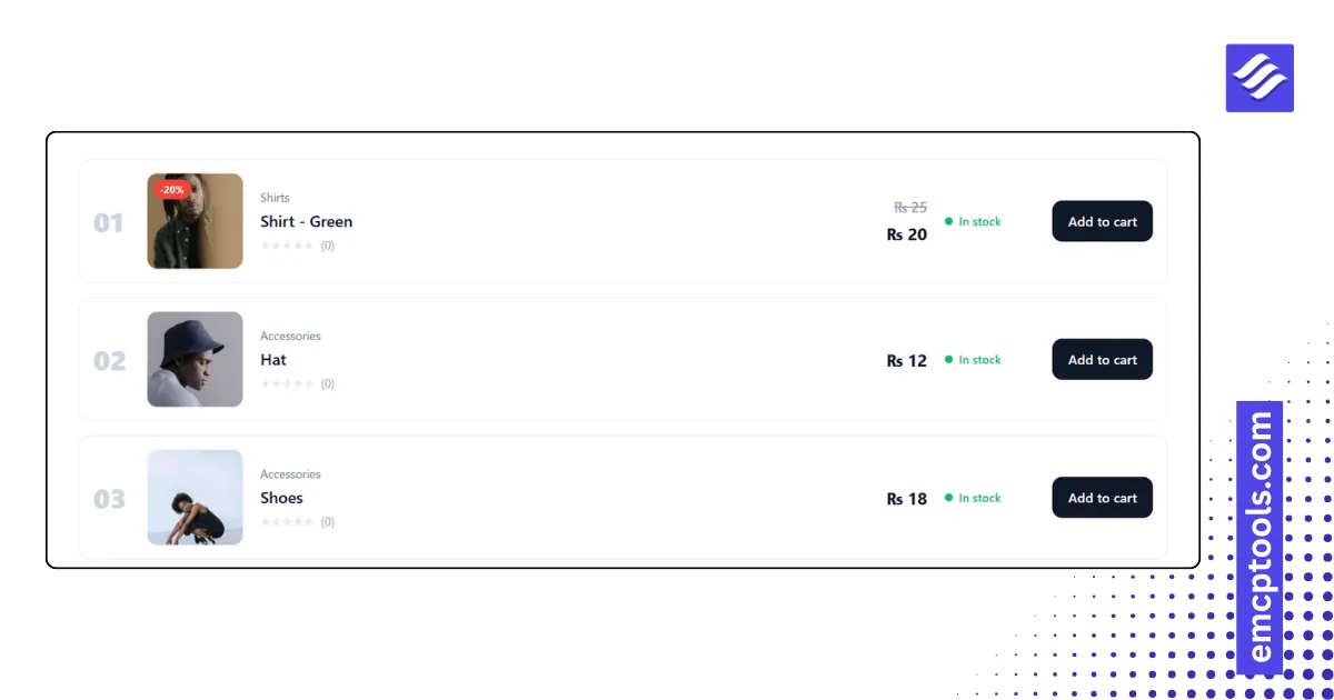
Products List
Products as rows: image, category, SKU, rating, description, price, stock status and Add to cart, in rows, compact, numbered or table styles.
MSR Builds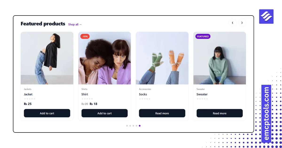
Product Slider
A product carousel with a heading row, arrows, dots, autoplay and the same card layouts as Products Grid.
MSR Builds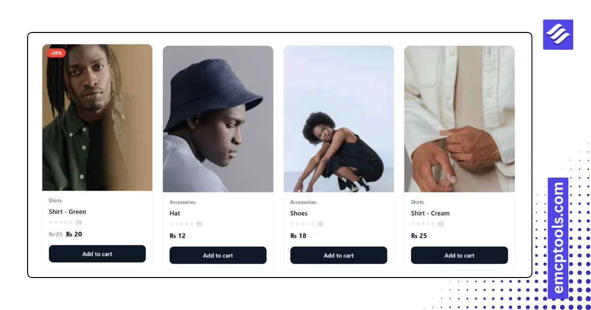
Products Grid
A product grid with five card layouts, sale and featured badges, brand, rating, hover image swap and Add to cart, driven by a Query panel.
MSR Builds
Post Carousel
A post slider with card, overlay or minimal cards, autoplay, loop, arrows and dots, driven by a Query panel.
MSR Builds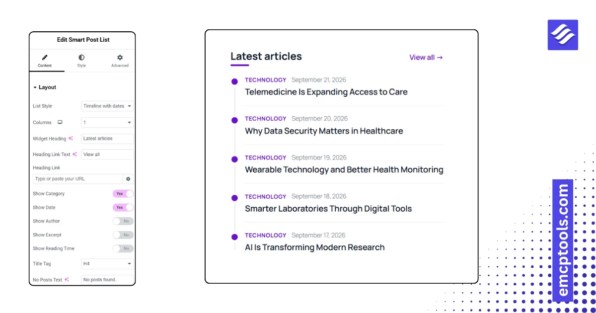
Smart Post List
A compact post list for sidebars and footers in six styles: thumbnail left or right, numbered, featured plus list, timeline, titles only.
MSR Builds
Post Block
A responsive blog grid with six card layouts, category badge, excerpt, author, date, reading time and read-more, driven by a Query panel.
MSR Builds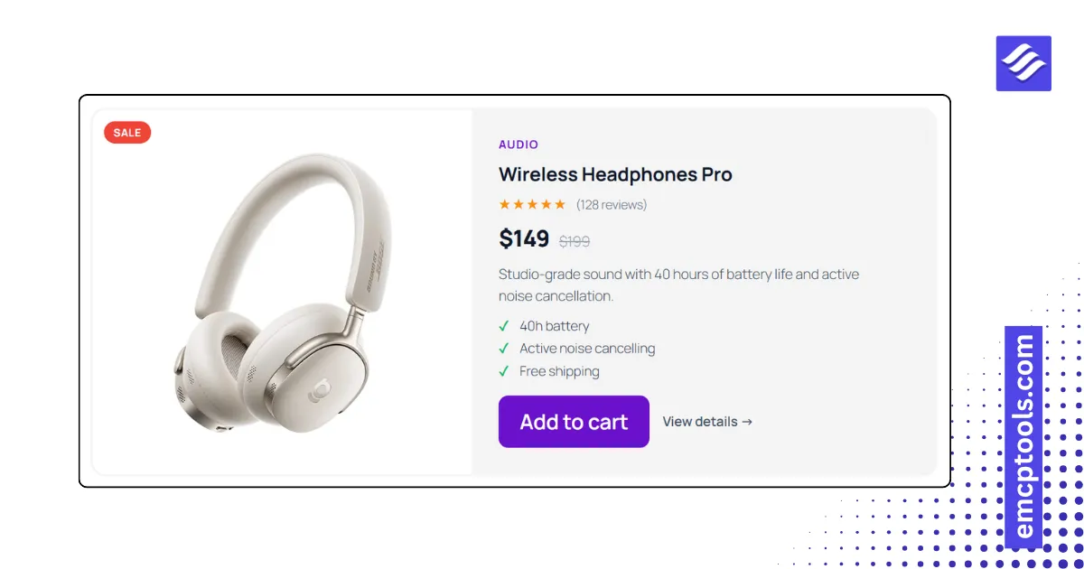
Static Product Card
A hand-made product card with image, hover image, badge, rating, price, old price, highlights and two buttons, no shop required.
MSR Builds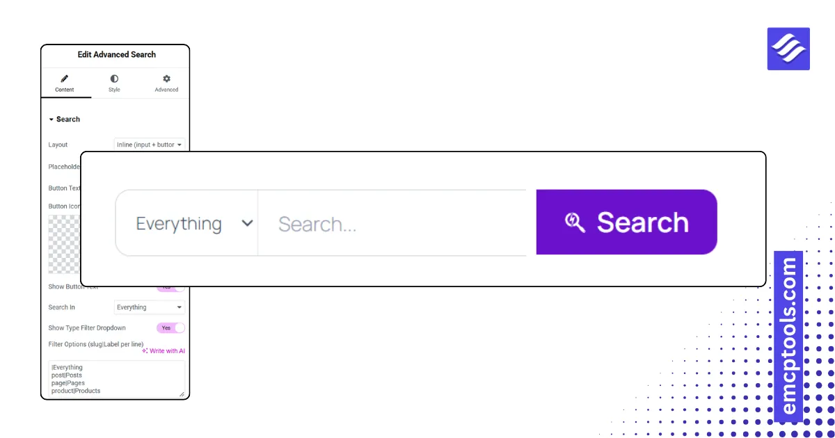
Advanced Search
A search form with live results while typing, a post-type filter, and inline, minimal, expanding icon or full-screen layouts.
MSR Builds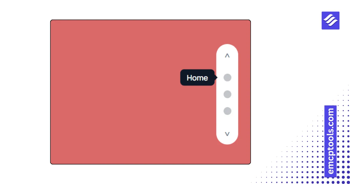
One Page Navigation
Fixed side dots that highlight the current section and smooth-scroll to it, in six styles including labels, icons and numbers.
MSR Builds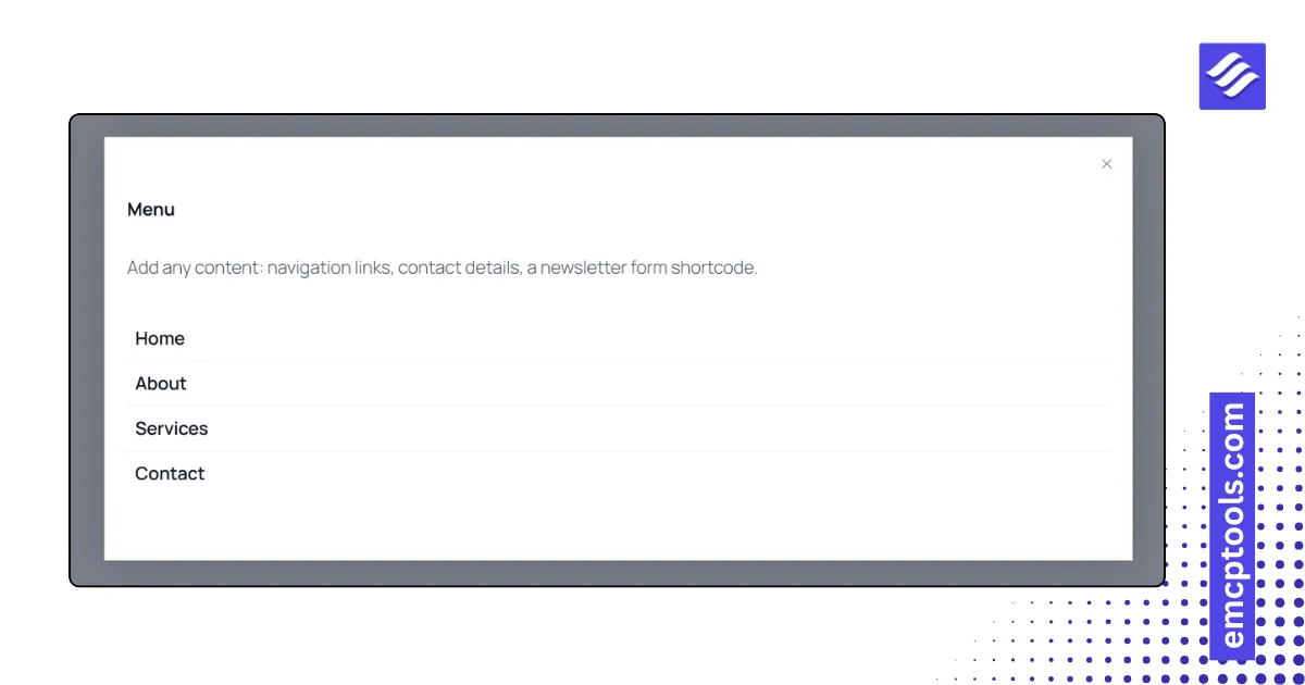
Offcanvas Panel
A slide-in panel from any edge with push, reveal or scale page effects, triggered by a button, icon, animated hamburger or floating tab.
MSR Builds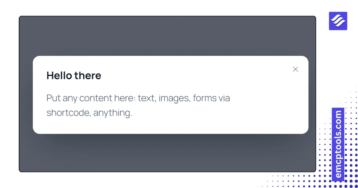
Lightbox & Modal
A popup with six triggers (button, image, text, page load, exit intent, scroll depth) for rich text, an image, a video or an embed.
MSR Builds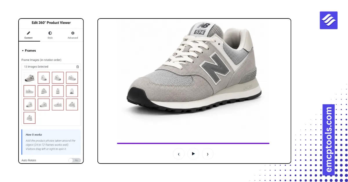
360° Product Viewer
Drag to spin a product through a sequence of frame images, with auto rotate, controls and a progress bar.
MSR Builds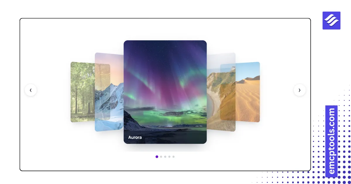
Flip Carousel
A 3D image carousel in coverflow, flat carousel, wheel or stacked deck style with captions.
MSR Builds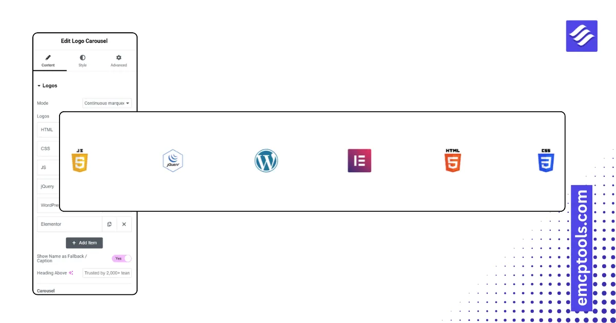
Logo Carousel
Client and partner logos as a continuous marquee, a slide carousel or a static grid, with grayscale-to-colour hover.
MSR Builds
Team Member Carousel
A team carousel with photo, role, bio and social links in five card layouts, including a hover overlay.
MSR Builds
Testimonial Slider
A review carousel with star ratings, avatars and company logos in five card layouts.
MSR Builds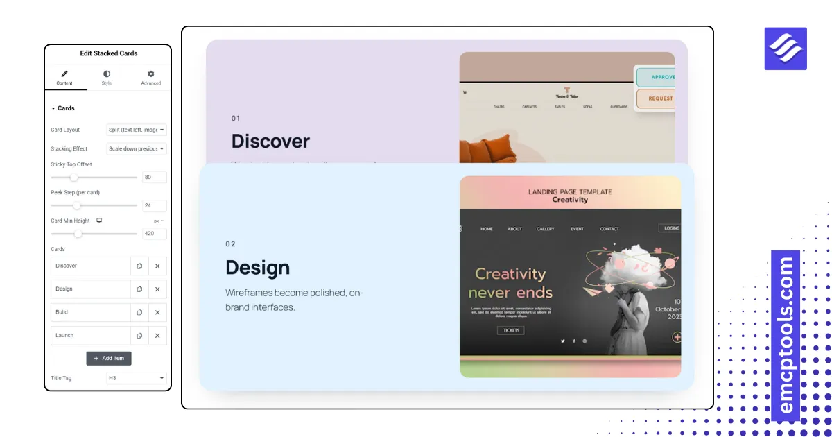
Stacked Cards
Full-width cards that stick and stack as the visitor scrolls, each with its own colour, text and image.
MSR Builds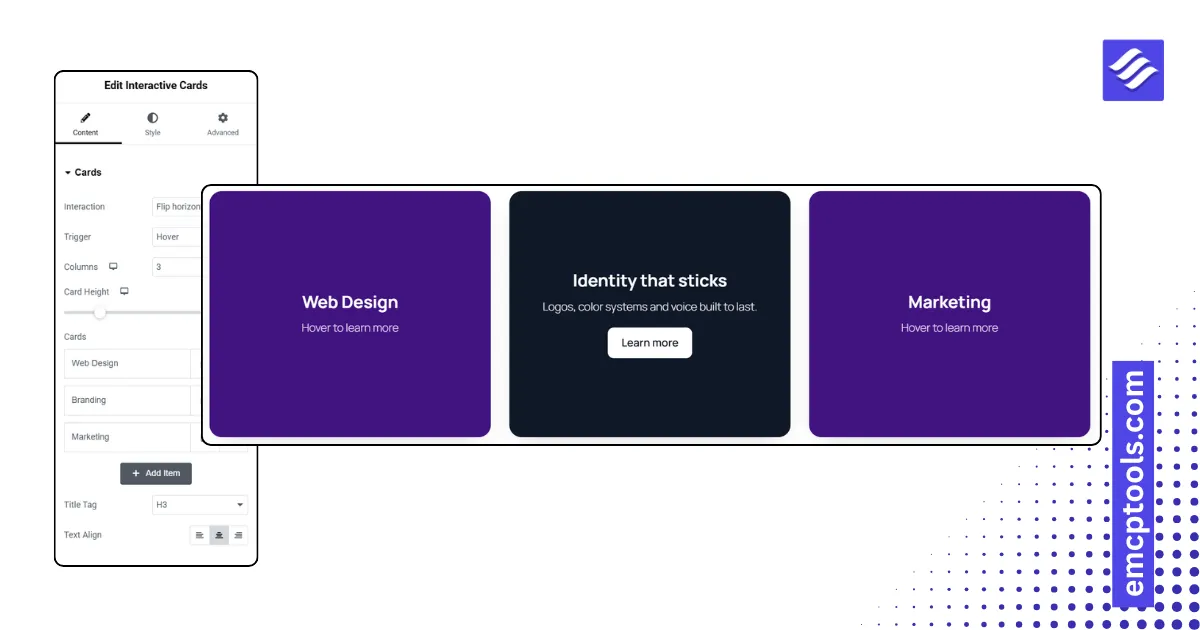
Interactive Cards
A grid of two-sided cards that flip, slide, fade, push or zoom to reveal the back on hover or tap.
MSR Builds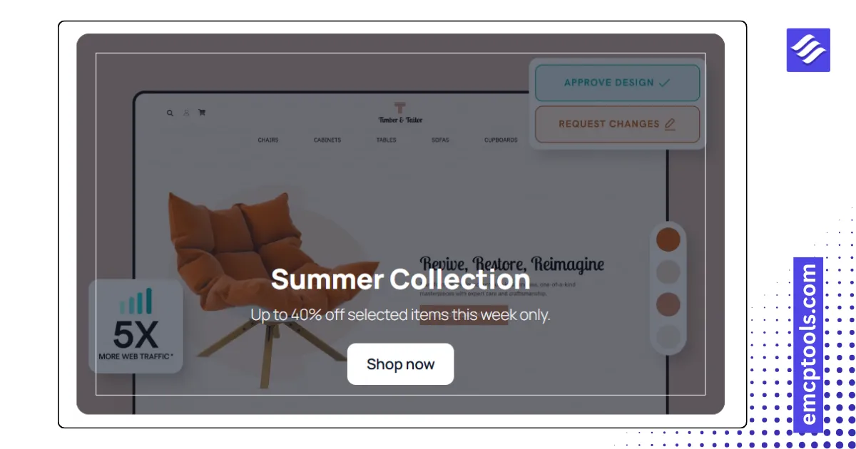
Interactive Promo
An image banner with ten hover effects that reveal a title, description and button.
MSR Builds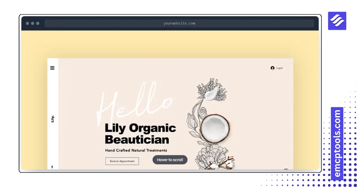
Image Scroller
A tall screenshot that scrolls inside a browser, phone or card frame on hover, on a loop, or by wheel.
MSR Builds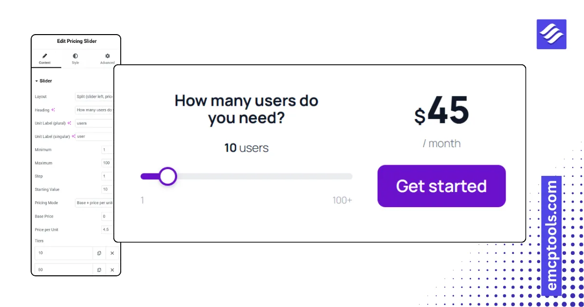
Pricing Slider
A range slider that computes a price from a base plus per-unit rate or from tiers, with a contact-us ceiling.
MSR Builds