
 A brief becomes a real page.
An existing Elementor page often needs a small correction, not a rebuild. Buttons may drift away from the copy because their wrappers each occupy half the row. A button may promise online ordering but open an email composer. A mobile container may still inherit its desktop width.
We used EMCP to make a scoped hero update on an existing restaurant demo. The finished draft retained all 190 elements. Nine existing elements changed, including two anchor targets that needed a fix discovered during browser testing. The original draft stayed unchanged.
This is a record of the actual edits, with before-and-after screenshots and prompts you can adapt. El Fuego is demonstration content, not a real restaurant case study. We did not measure conversion or ranking improvements.
The page and tools we tested
The demo site ran Elementor 4.2.4 and EMCP Premium 3.16.1, with no Elementor Pro active. These are the tested versions, not minimum requirements. The existing page had 81 containers and 109 widgets across 11 top-level sections.
Although that Elementor installation supports atomic elements, this particular page uses classic widgets and containers. Inspect the actual tree before choosing tools. An installed version number alone does not tell you how an existing page was built.
We used the connected site’s export, create-page, batch-update and schema tools. The original page also contained one CSS-only HTML widget; we left it intact and added no HTML widgets. Check the Elementor integration and tool reference for the workflow available on your site.
Preserve the original and define the scope
We exported source draft 23 and created draft 49 with the same element tree and an Elementor Canvas template. A fresh export confirmed that the copy’s initial tree matched the original exactly. Use your own verified page IDs when reproducing this process.
Our task was to align the two hero buttons with the left edge of the headline and paragraph, replace their oversized wrappers with content-sized widths, and keep a consistent 16px gap. We also revised the paragraph and secondary button, made mobile CTA widths explicit, improved primary-button hover contrast and verified the links. We preserved the original headline, palette, images, section order and global kit.
Start with a prompt like this:
Confirm the connected WordPress site and installed Elementor version.Inspect the existing page's element tree and export its current state.Create a separate draft copy for this edit.
Review only the hero heading, paragraph and two buttons.Align the CTA group with the copy's left edge, with a 16px gap.Inspect wrapper widths and padding; stack full-width buttons on mobile.Identify their actual element IDs and inspect each button's destination.Propose copy supported by the page and destinations that really exist.Keep the palette, images, global kit and other content unchanged.
Make the button promise match its destination
The hero’s original Order online button used a mailto: link. It opened an email composer rather than an ordering flow. We changed its label to Plan your visit and linked it to #visit, the intended location-and-hours section.
The primary View the menu button retained its #menu destination. We did not invent an ordering provider, create a reservation system or submit an email.
| Hero field | Before | After |
|---|---|---|
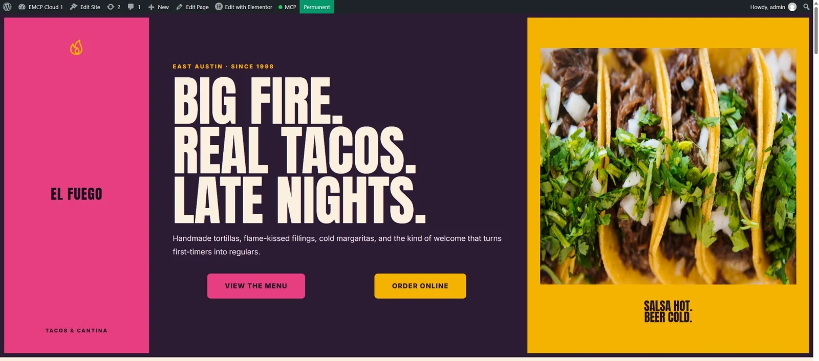
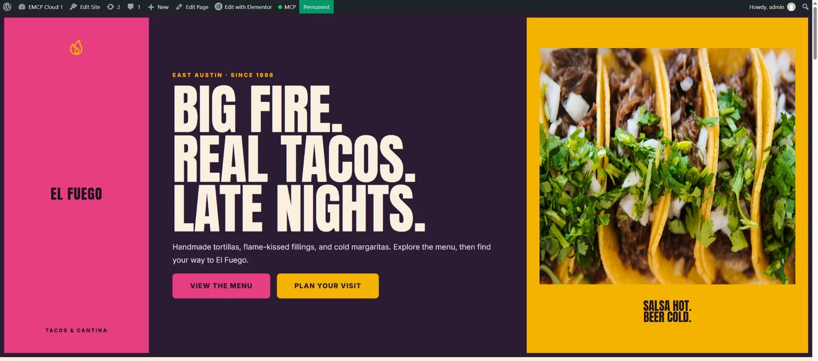
| Desktop CTA layout | Buttons centred in separate 50%-width wrappers | Content-sized wrappers, left-aligned with the copy, 16px gap |
| Heading | Big Fire. Real Tacos. Late Nights. | Original wording retained |
| Supporting copy | A longer welcome message | A shorter description followed by a menu-and-visit instruction |
| Secondary button | Order online → email composer | Plan your visit → visit section |
| Mobile heading size | 52px | 46px |
| Mobile button wrappers | Inherited 50% desktop widths | Explicit 100% widths and stretch alignment |
| Primary hover text | Pink on white | Dark ink on white |
Before — original authenticated draft preview:
After — edited draft at the same 1940px browser width (matching hero crops):
Fix the layout at the container level
Changing button alignment alone did not solve this layout. Each button sat inside a container with a 50% width and centred children. That pushed the first CTA away from the copy and left a large empty space between the buttons.
We set the CTA row to flex-start, removed its padding and gave it a 16px gap. Both child wrappers now use width: { "unit": "custom", "size": "auto" }, zero padding and flex-start alignment. These are native Elementor container settings; no HTML widget or custom CSS was added. The row can wrap when space is limited. On mobile, the explicit 100% wrapper widths and stretch alignment take over.
In the desktop browser check, the headline, CTA row and first button shared the same left coordinate. The measured space between button wrappers was 16px. This is the visible design correction demonstrated above; the headline wording does not need to change to show it.
Update existing widgets by their IDs
The first batch changed seven elements. Here is an excerpt of the payload passed to emcp-tools-batch-update:
{ "post_id": 49, "operations": [ { "element_id": "857eeee", "settings": { "text": "Plan your visit", "link": { "url": "#visit" } } }, { "element_id": "e73709e", "settings": { "width_mobile": { "unit": "%", "size": 100 }, "flex_align_items_mobile": "stretch" } } ]}These element IDs belong to our demo. Read your target page first. The operation merges supplied settings; inspect existing nested objects before replacing them so you retain any relevant values.
The button itself already had mobile alignment settings. Its wrapper needed attention too. A useful inspection follows the layout from the widget through its parent containers, rather than repeatedly changing the button alone.
Test the destination, not just the saved link
Our first browser check found that the saved #visit destination did not scroll to the section. The page data contained css_id: "visit", but the rendered container had no HTML ID. The menu target had the same problem.
We inspected the installed container schema. In this version, the native CSS ID control uses _element_id. We updated just the two target containers:
{ "post_id": 49, "operations": [ { "element_id": "b59869c", "settings": { "_element_id": "menu" } }, { "element_id": "745016b", "settings": { "_element_id": "visit" } } ]}After reloading the preview, both IDs appeared in the rendered page. Clicking the hero links scrolled to the corresponding sections, just below the WordPress toolbar. That brought the final change set to nine existing elements, with none added or removed.
This is why a successful save is only one check. A link value can be correct while its target is missing. Confirm the installed schema and inspect the result before treating an edit as complete.
Verify native editing and responsive layouts
We opened the edited draft in Elementor, selected the button, and confirmed that its normal Text and Link controls showed Plan your visit and #visit. The revised heading also remained a native Heading widget with its title and H1 controls.
We checked the desktop frontend at a 1940px viewport, then reviewed Elementor’s approximately 360px Mobile Portrait and 768px Tablet Portrait previews. On mobile, the headline fitted the content column and the two CTA buttons stacked. On tablet, the buttons remained side by side.
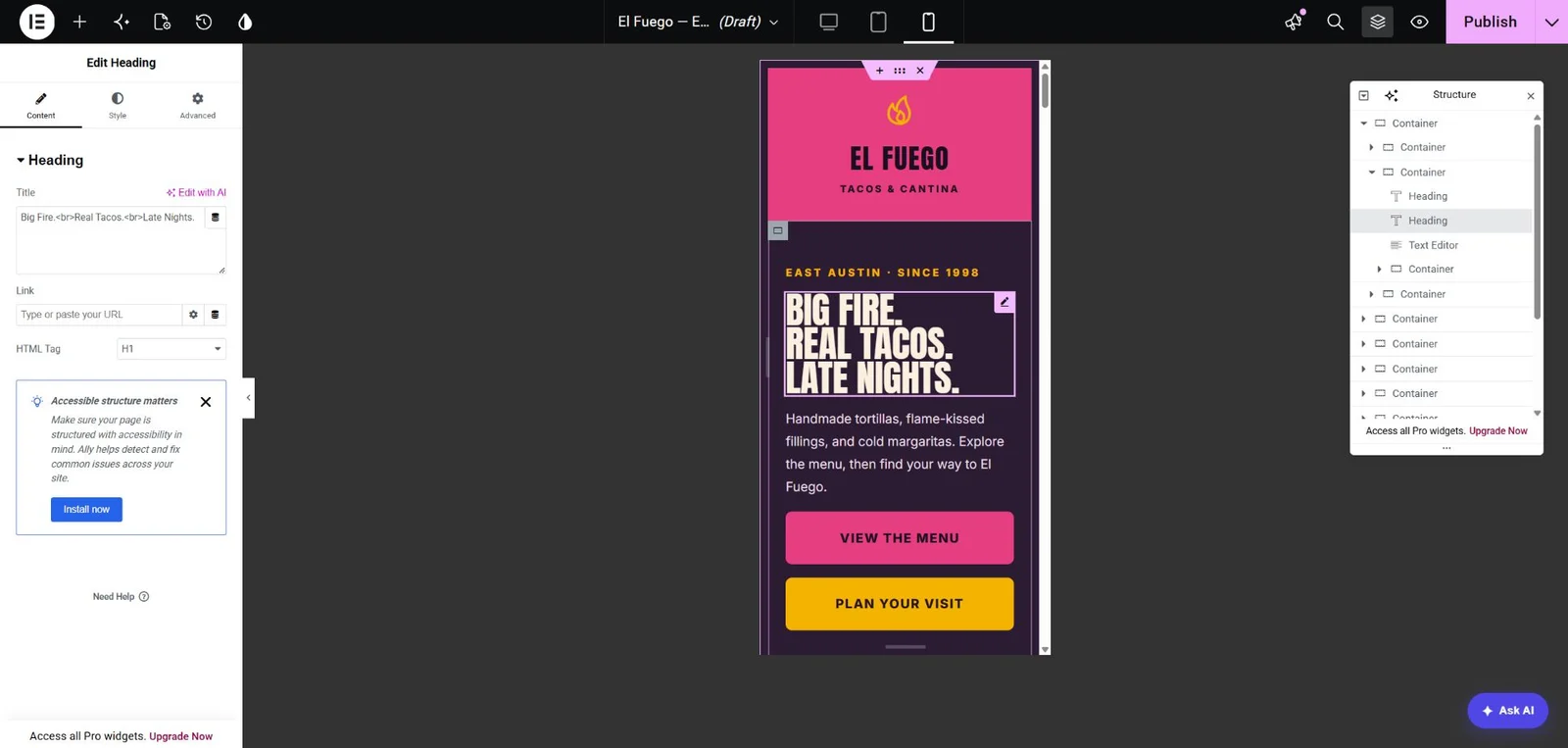
Actual Elementor Mobile Portrait preview. This checks the editor’s responsive rendering; it is not a physical-device test.
The final data comparison confirmed:
- The page still contained 190 elements across the same 11 top-level sections.
- Exactly the nine intended elements had changed settings.
- The source draft’s element tree still matched its original export.
- The edited copy remained a draft, ready for further review.
The rest of the restaurant demo—including placeholder business details and a separate lower-page ordering CTA—was outside this hero edit. These checks do not certify the entire page’s accessibility, business accuracy or mobile behaviour.
Reuse the verification prompt
Read the edited page again and compare it with the saved baseline.List every changed element and field; flag anything outside our scope.
Open the draft in Elementor and inspect the native controls.Compare the frontend before and after at the same viewport.Review the mobile and tablet layouts, and click each changed link.If a target fails, inspect its rendered HTML and installed control schema.Keep the page as a draft and report any remaining limitations.
For a new page, follow our tested Bricks build tutorial. For metadata rather than layout edits, see the Rank Math workflow. To connect your own site, start with the Claude Code connection guide and check Free vs Pro for the tools you need.